Visit the team socials below:
Mission:
Approached by APRL with this new organization, the main goal of this brand was to create a clean, professional, yet fun image for the team. One of the main criteria was that the brand look "NASA-esque," which led the design team to the logo you see today - its constellation design with a rocket ship flying out of its perimeter alludes to NASA's famous meatball logo.
Approached by APRL with this new organization, the main goal of this brand was to create a clean, professional, yet fun image for the team. One of the main criteria was that the brand look "NASA-esque," which led the design team to the logo you see today - its constellation design with a rocket ship flying out of its perimeter alludes to NASA's famous meatball logo.
Initial concept boards were first drawn up, including a color palette variant that stuck closer to UC Davis' school colors. Ultimately, design iterations landed us back on the original palette.
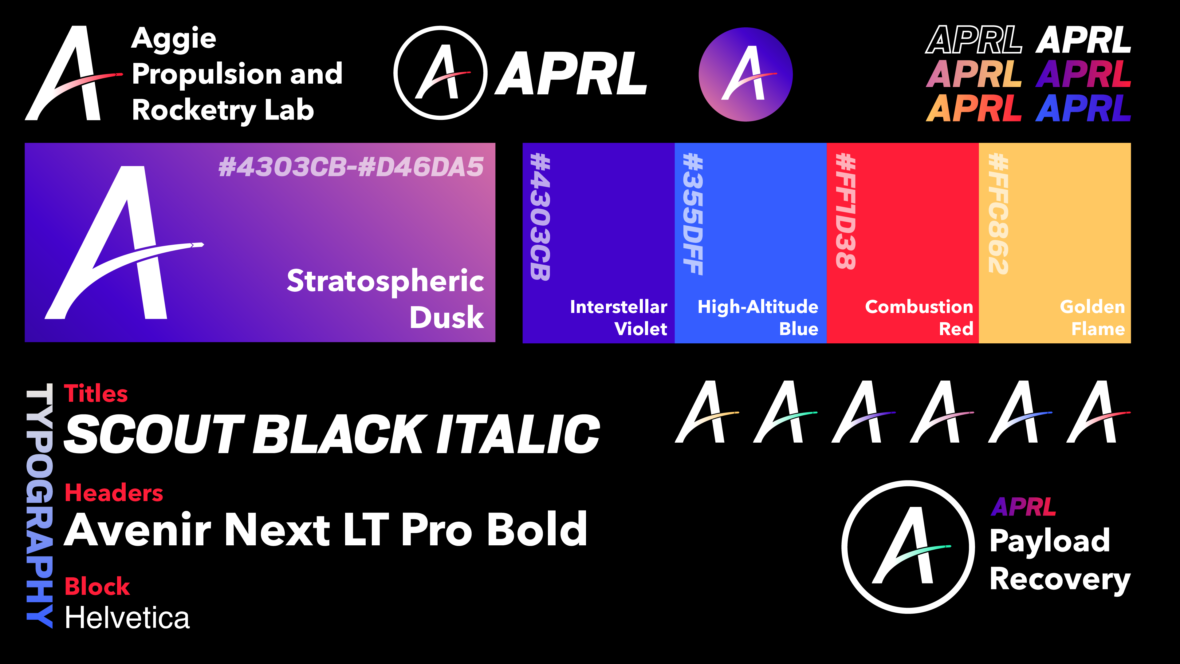
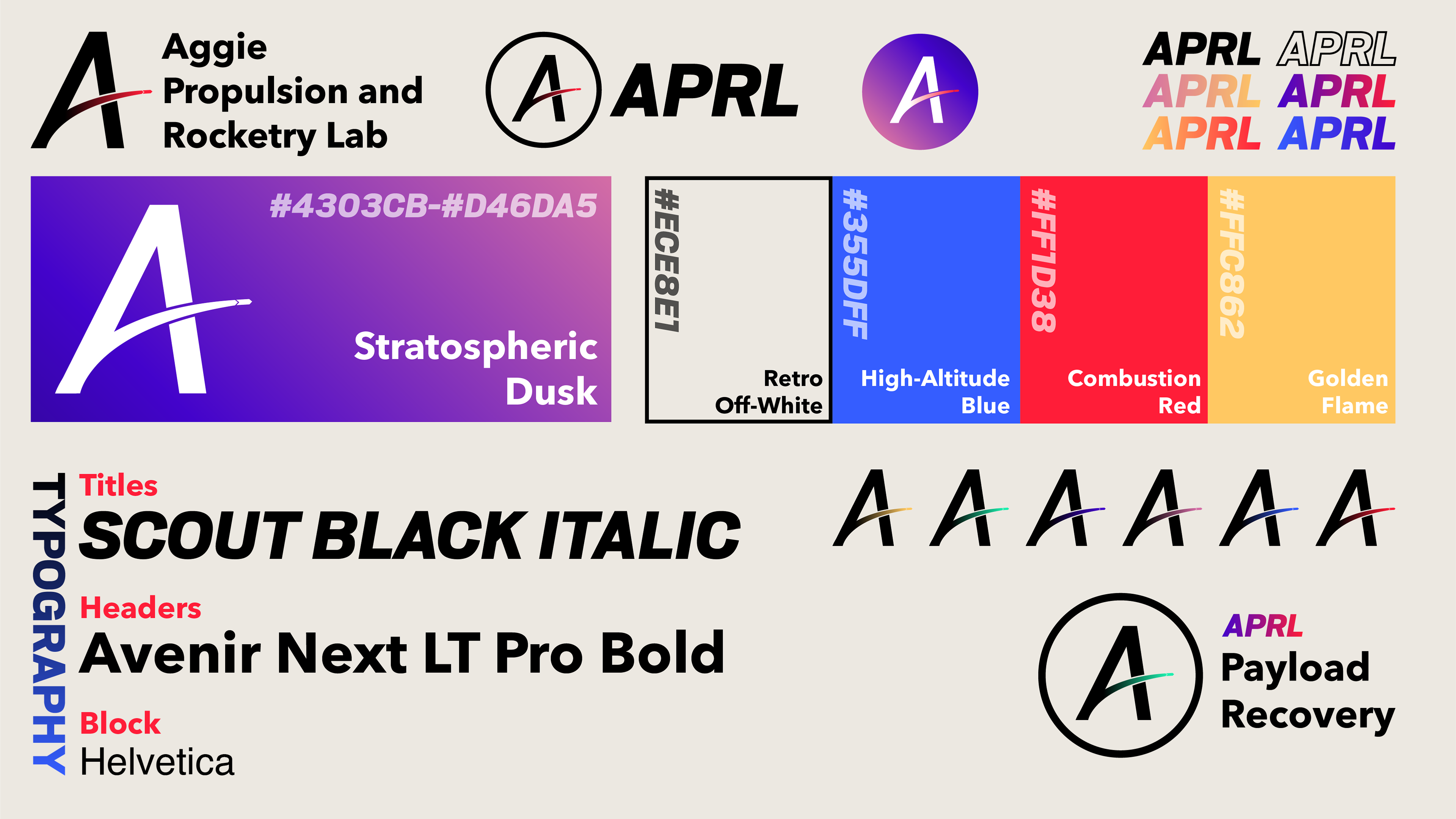
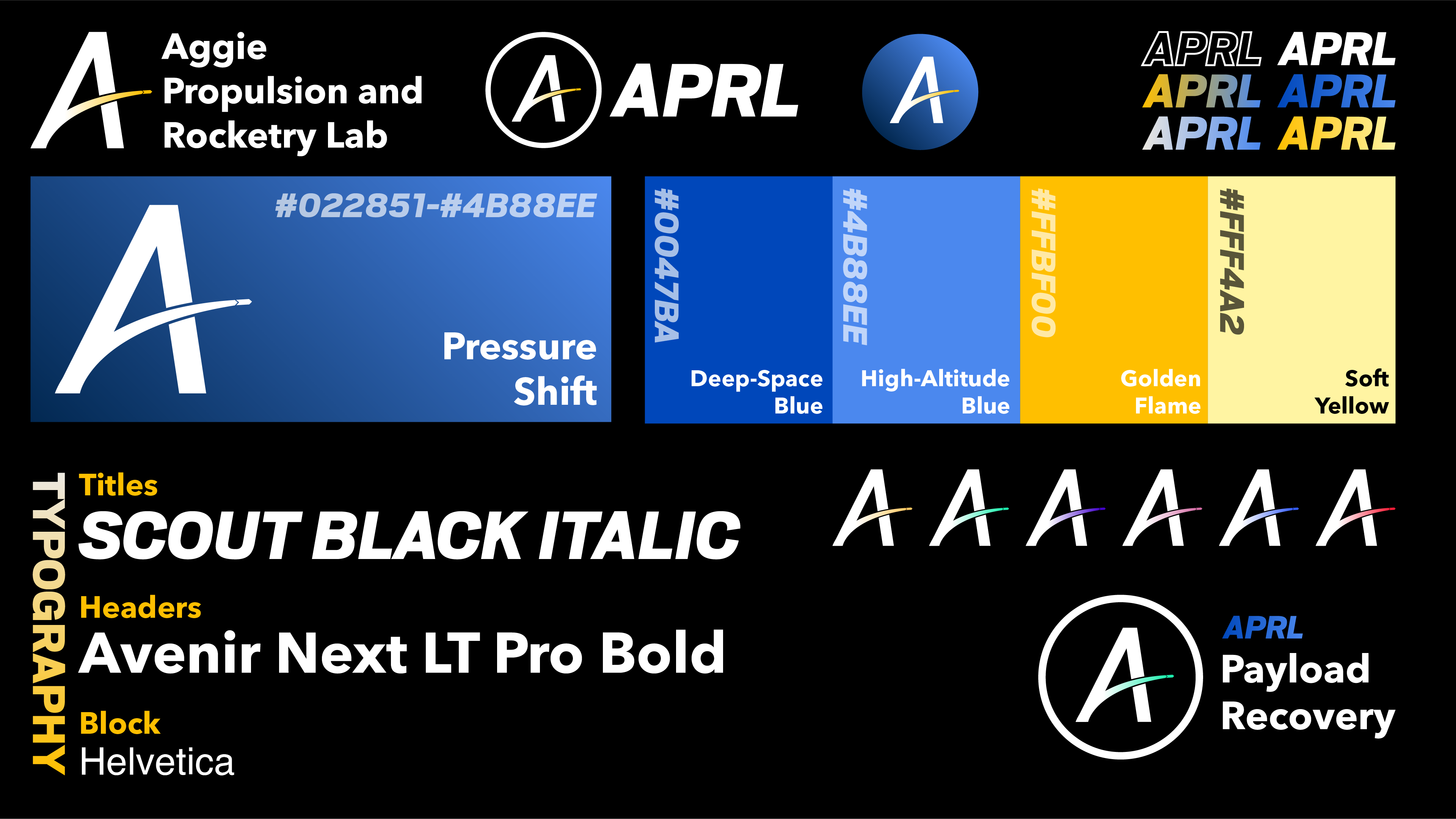
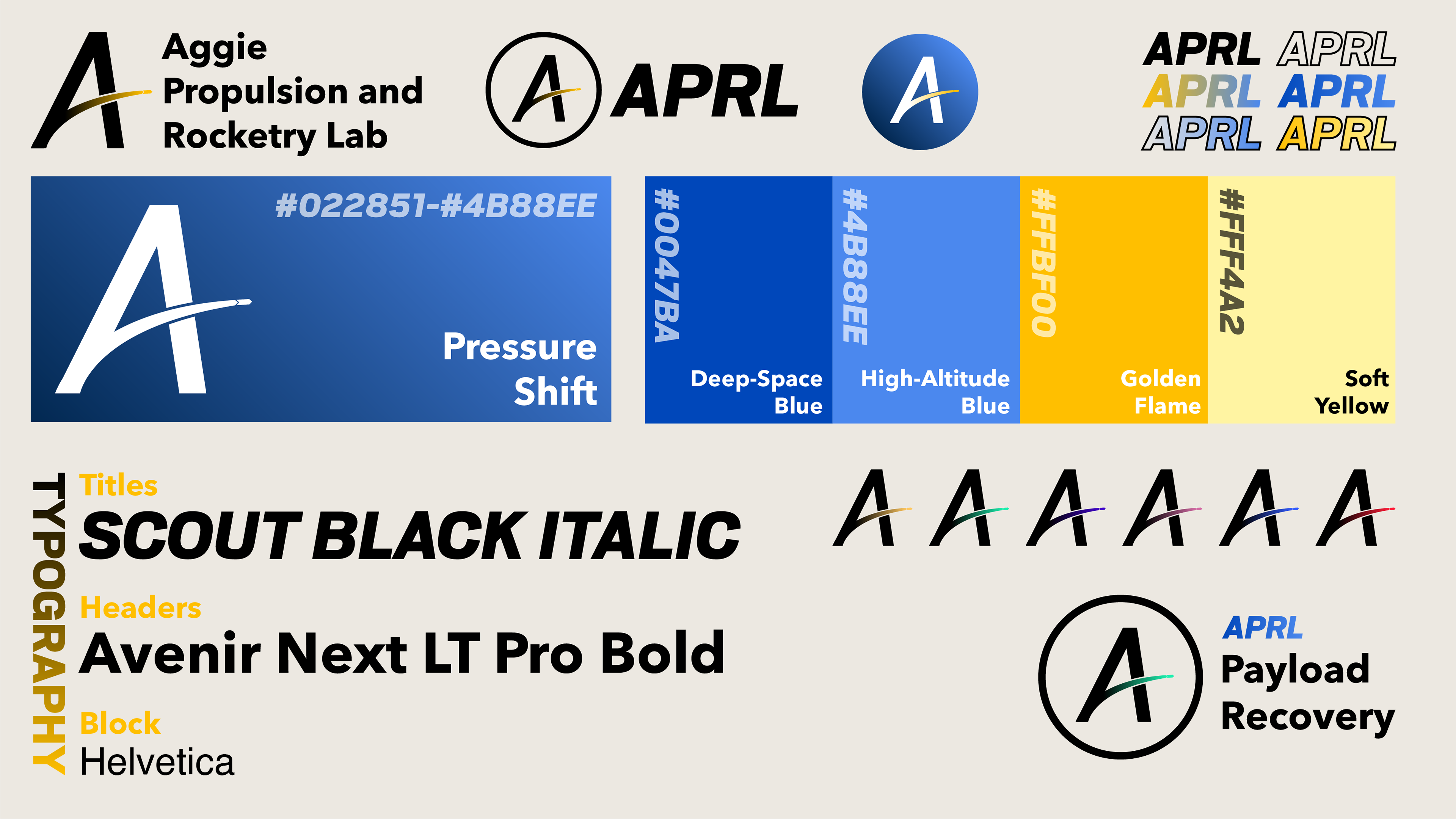
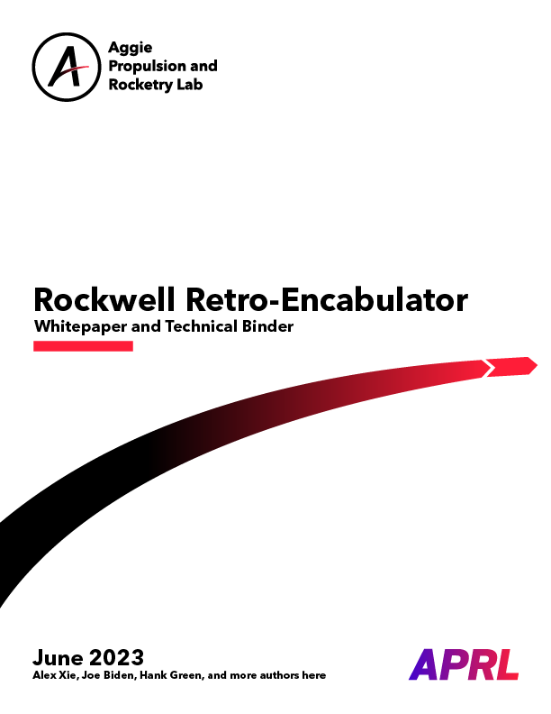
Additionally, tests such as document covers were created to give the team a sense of how the new brand would be incorporated into everyday elements.

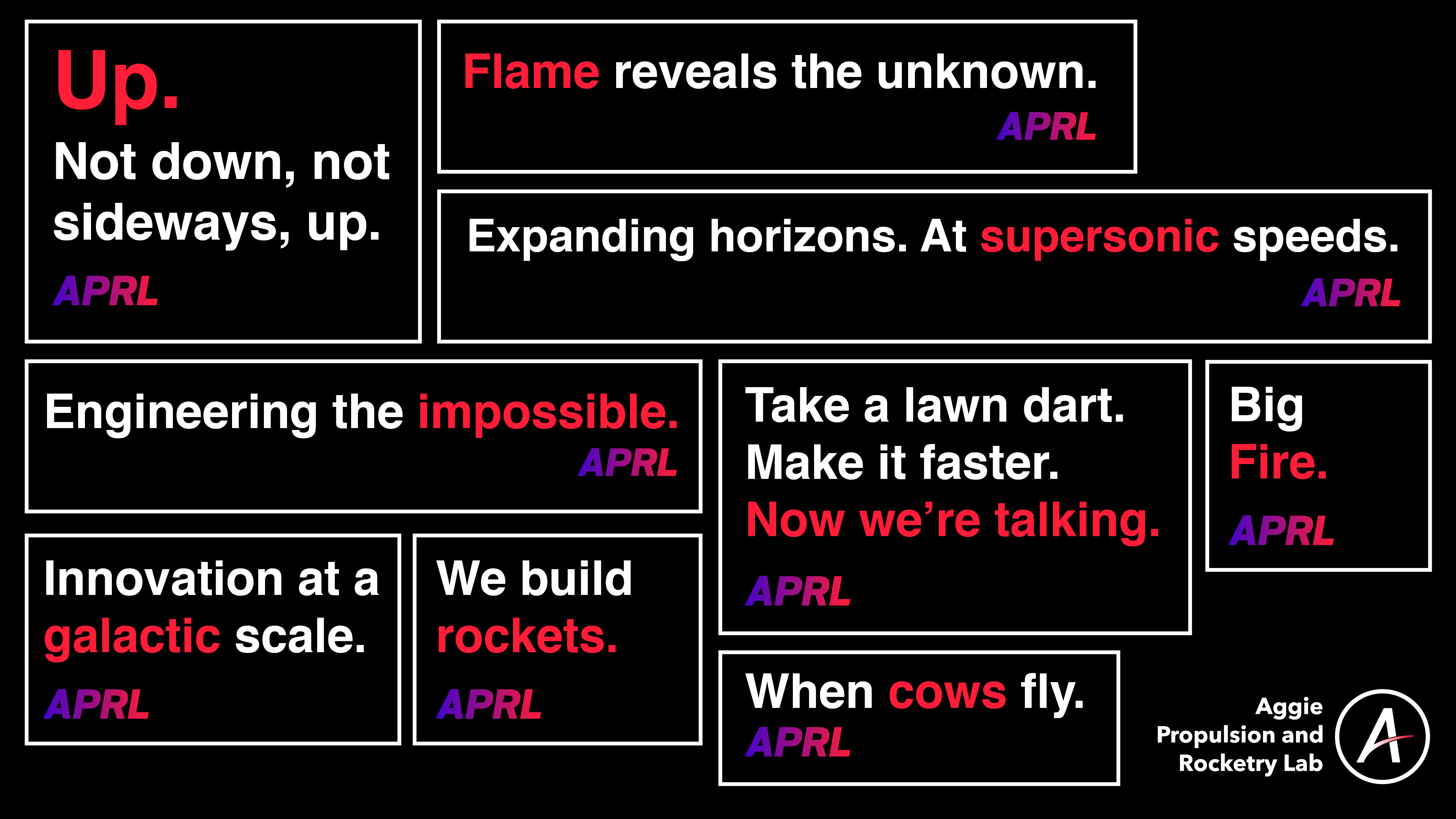
Finally, a slogan board and motion design concept were created for team identity. The motion graphics design concepts would be fleshed out later in a final promotional video.

Final Development Process:
Ultimately, the blue-and-red color palette was chosen, the typography approved, and the motion design nearly finished. The final task to complete was logo refinement - which coincidentally is also the most tedious part.
Ultimately, the blue-and-red color palette was chosen, the typography approved, and the motion design nearly finished. The final task to complete was logo refinement - which coincidentally is also the most tedious part.
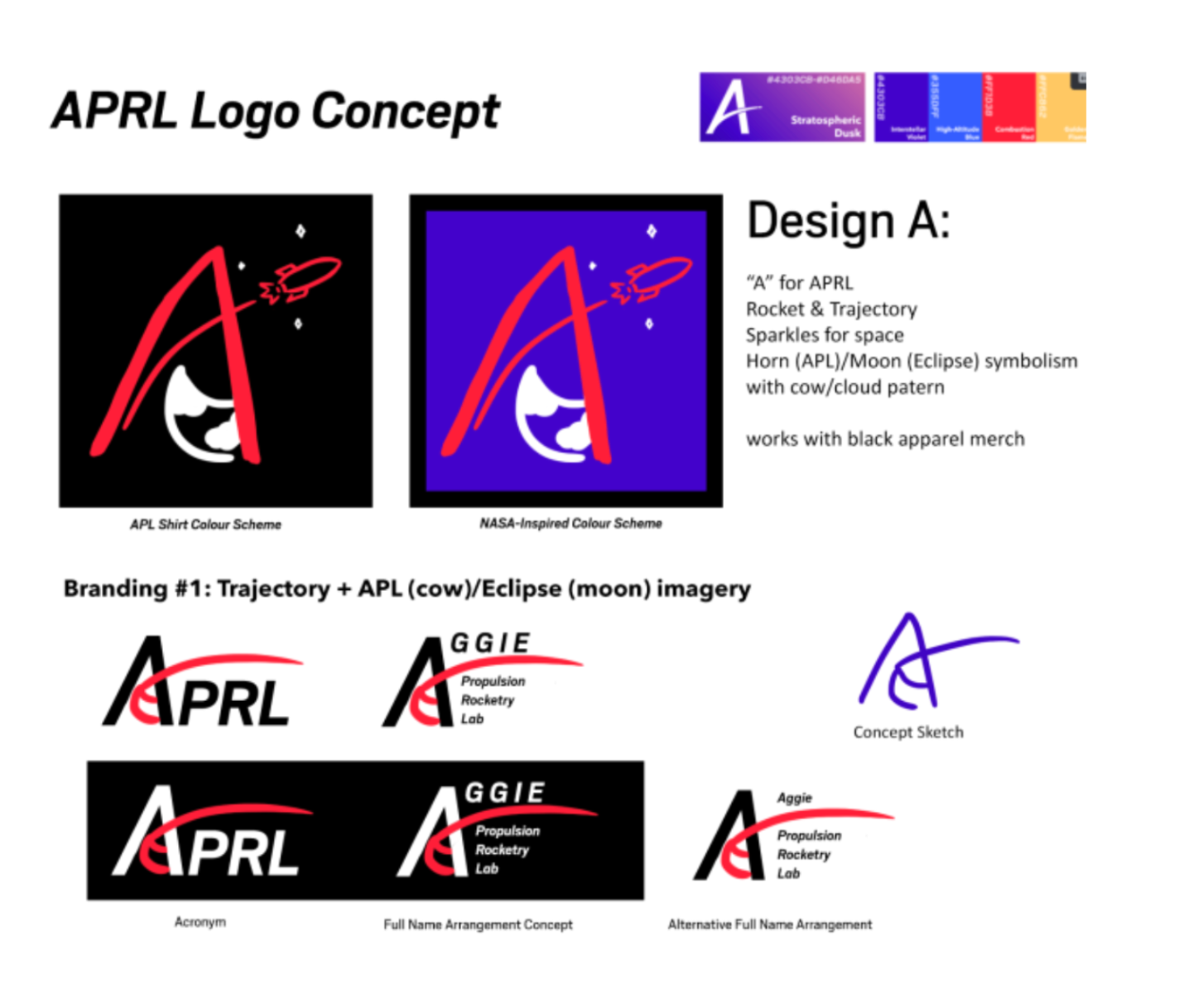
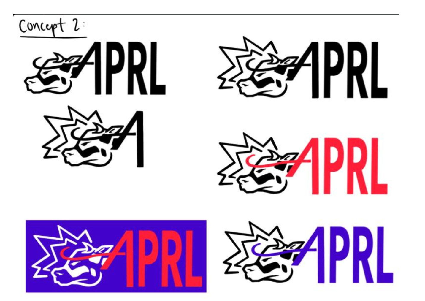
A small design contest among the branding team resulted in the above two winning concepts. After deliberation, the decision was made to move ahead with concept 1 as it felt like a more appropriate choice for our brand identity - concept 2 was shelved for further discussion for usage on merchandise.
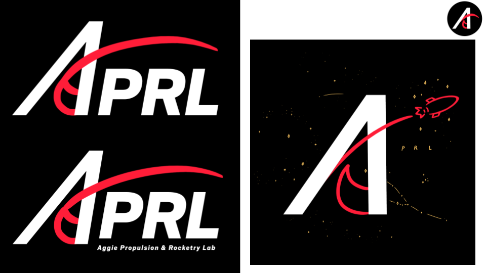
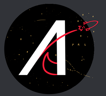
Shown above is the progression of the main logo, later dubbed the "Constellation Logo," and initial concepts of the wordmark, which would go on to become the Arc Logo.
Brand Launch and Promotion:
Once the brand was finalized, the last task was the launch and promotion of the new team. For this, an Instagram post wall was created - 3 individual posts that would come together to form a larger design.
Once the brand was finalized, the last task was the launch and promotion of the new team. For this, an Instagram post wall was created - 3 individual posts that would come together to form a larger design.
The top row would form the 3 cover images, while the second row's images would be attached to the center post to provide more information on APRL's brand identity.
Next, a promotional video utilizing the motion graphics principles defined earlier was created - it is currently scheduled for release in early 2024.
2024 Merchandise Project:
I decided to aim to create one unique merchandising project for APRL per year, and the 2023-2024 project began with basic themeboarding. I quickly decided on a "retro" look and built out some basic designs which would go on to be tested.
I decided to aim to create one unique merchandising project for APRL per year, and the 2023-2024 project began with basic themeboarding. I quickly decided on a "retro" look and built out some basic designs which would go on to be tested.
Our next challenge came with the imprint process - I really loved the idea of embroidering these garments, as it would preserve their finish for many years and aid in the "timeless" look. Unfortunately, the thin lines and intricate text meant that finding a process that would look good would prove to be incredibly challenging.
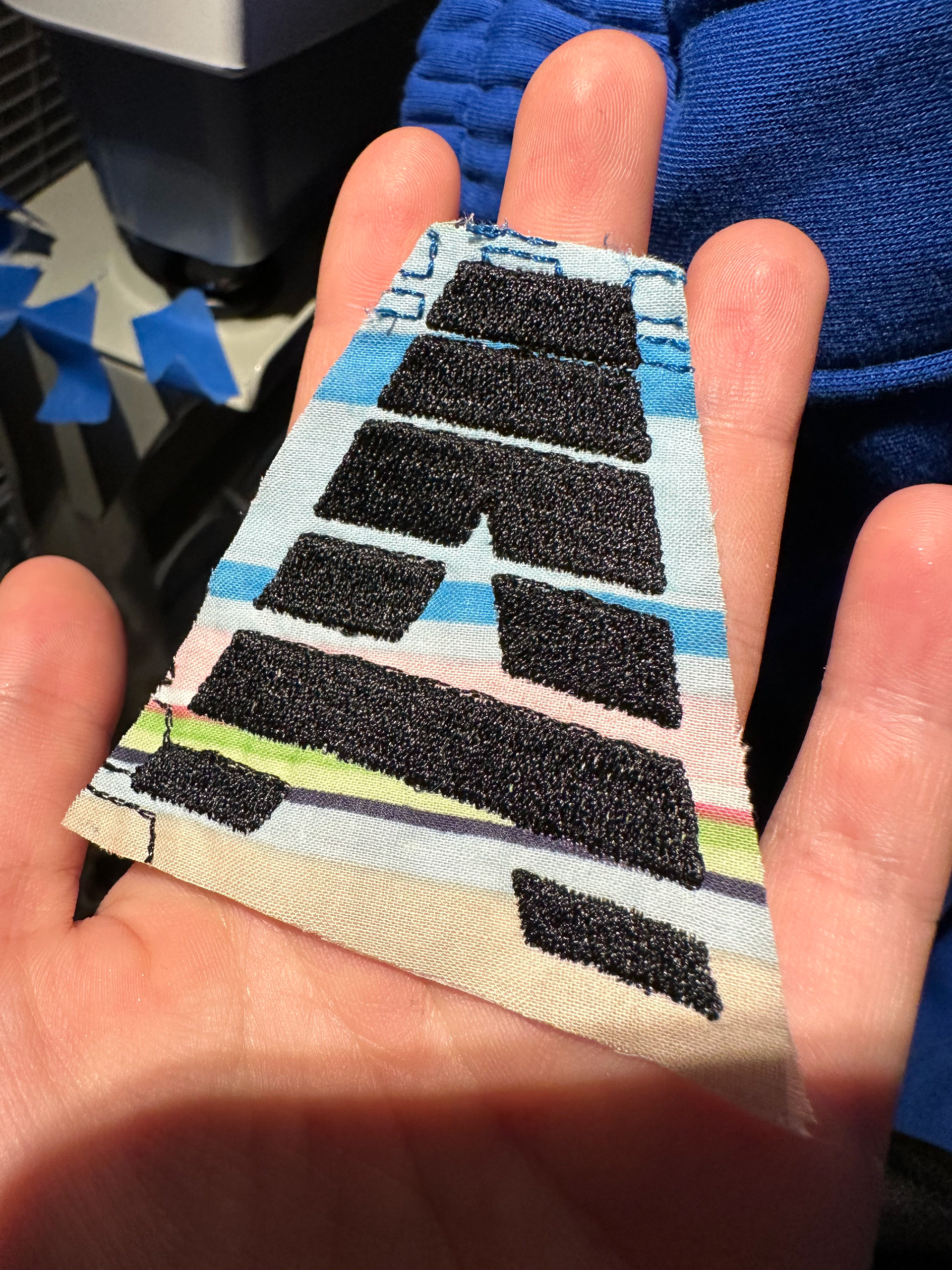
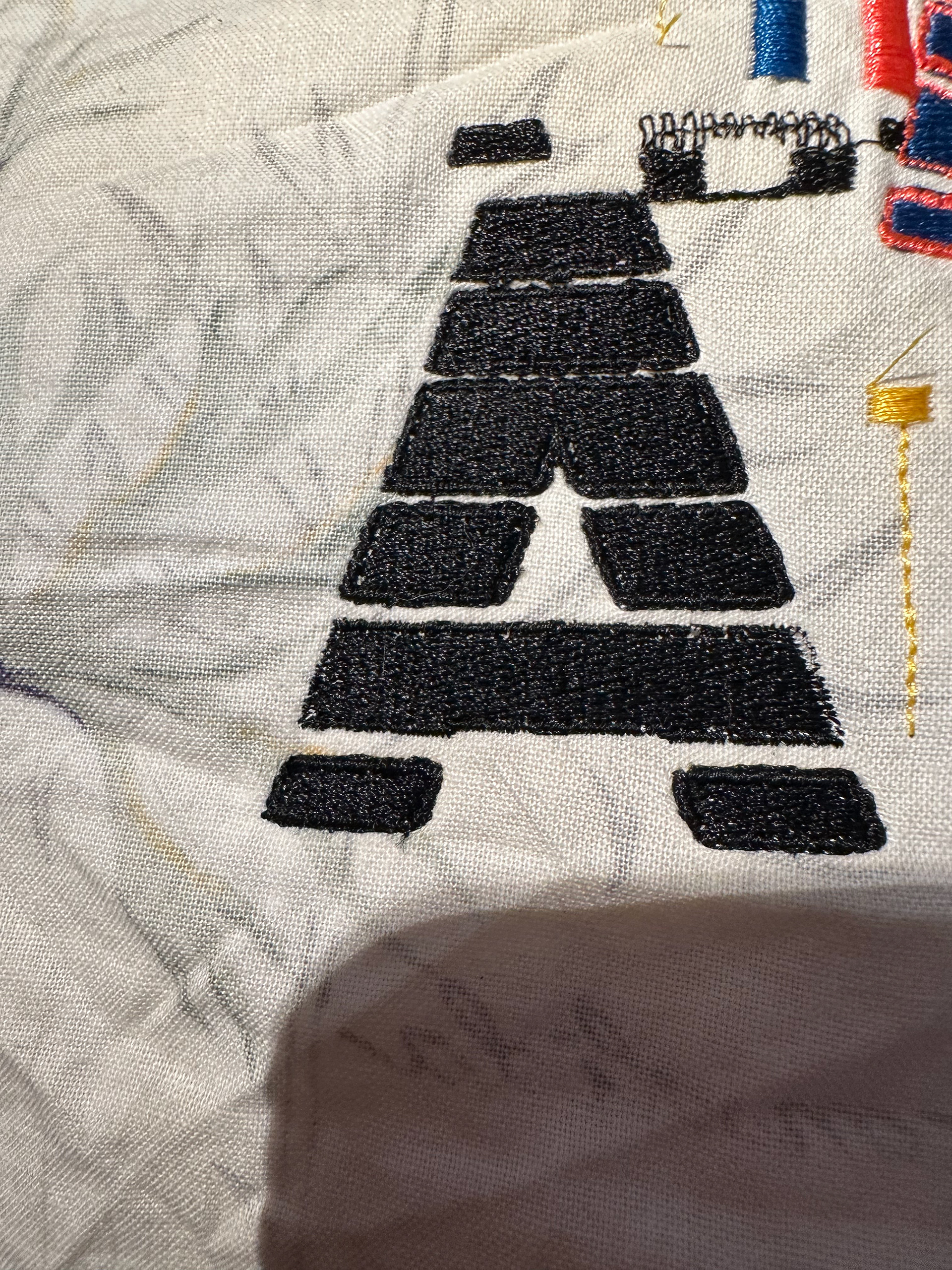
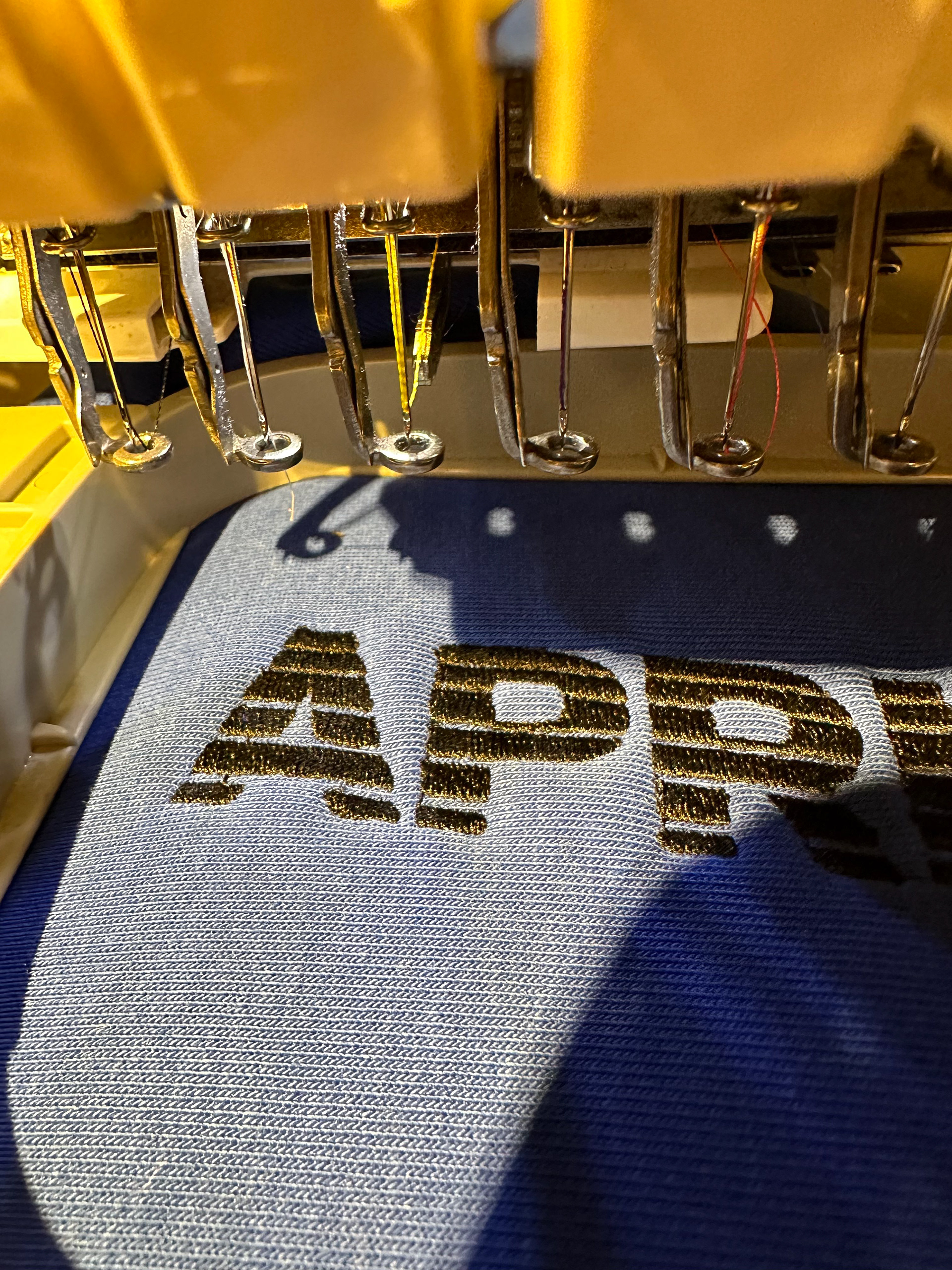


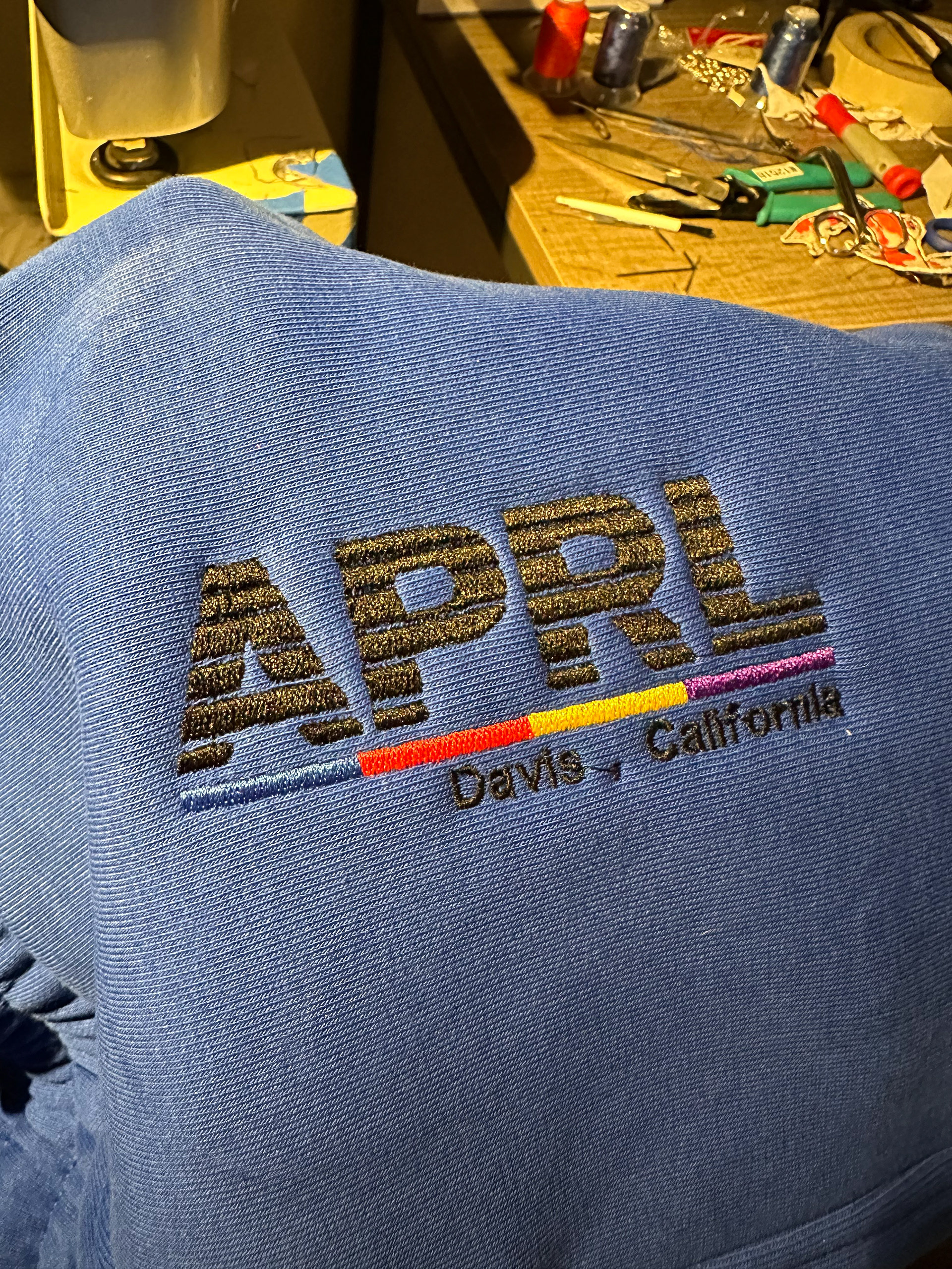
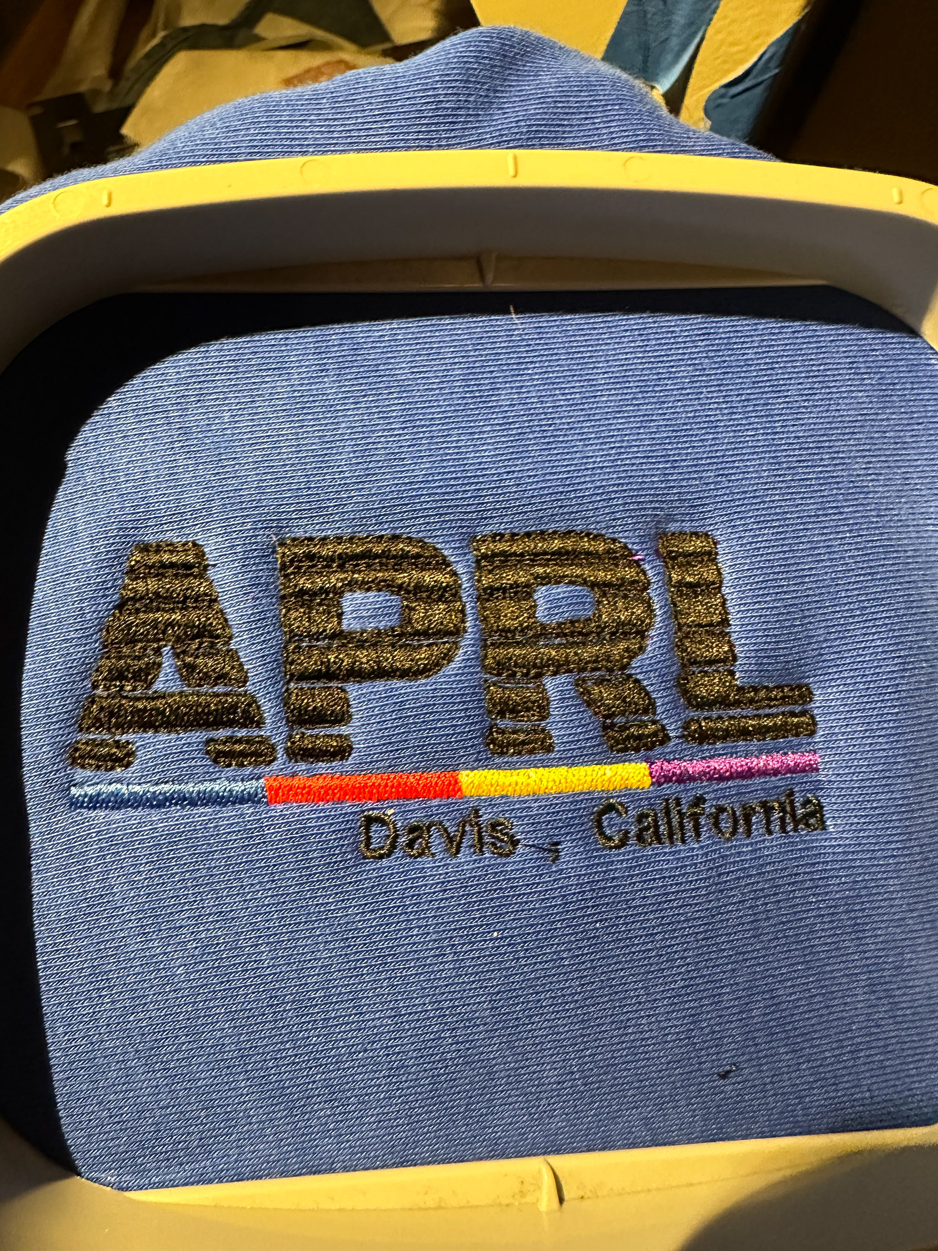
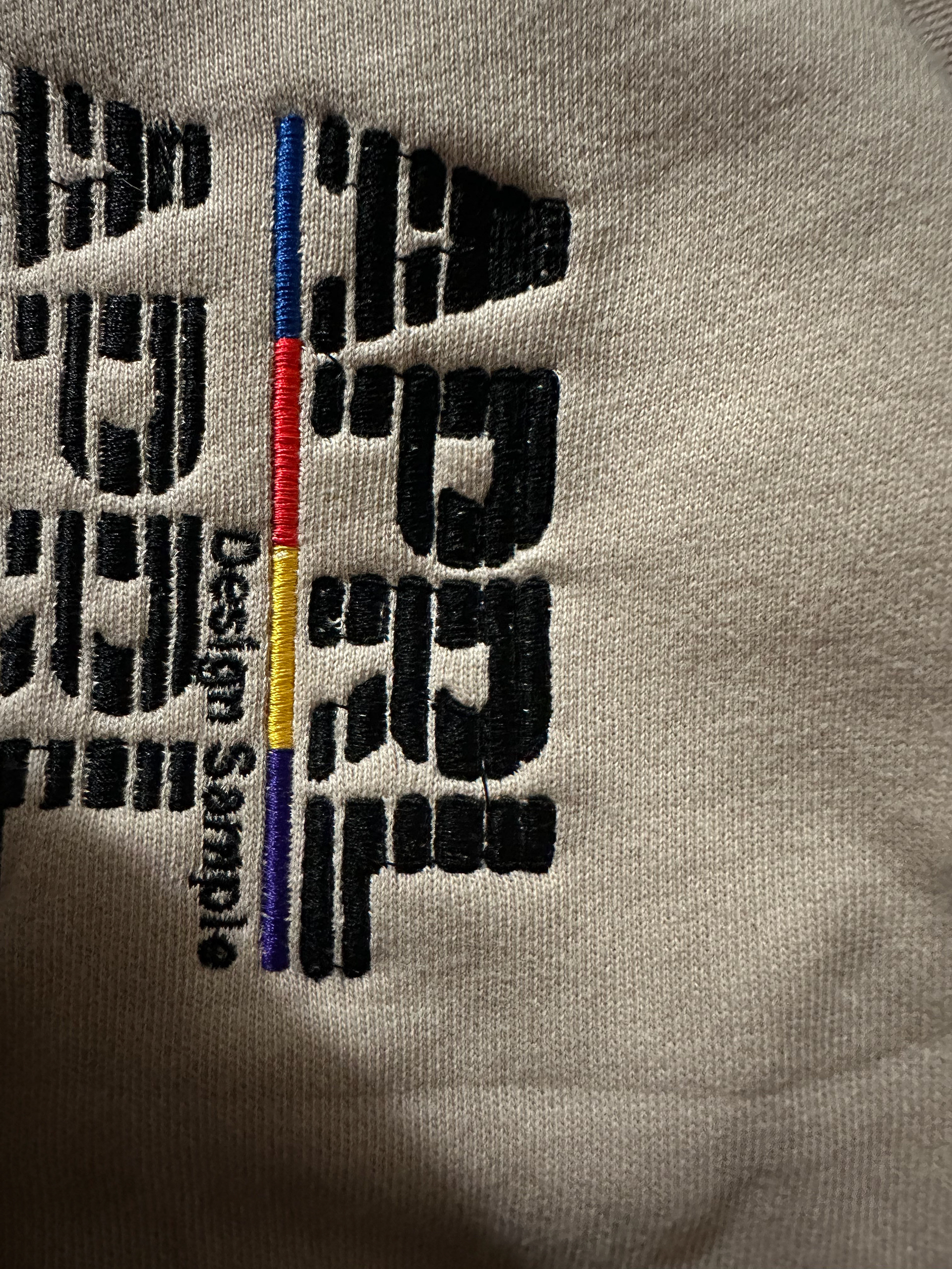

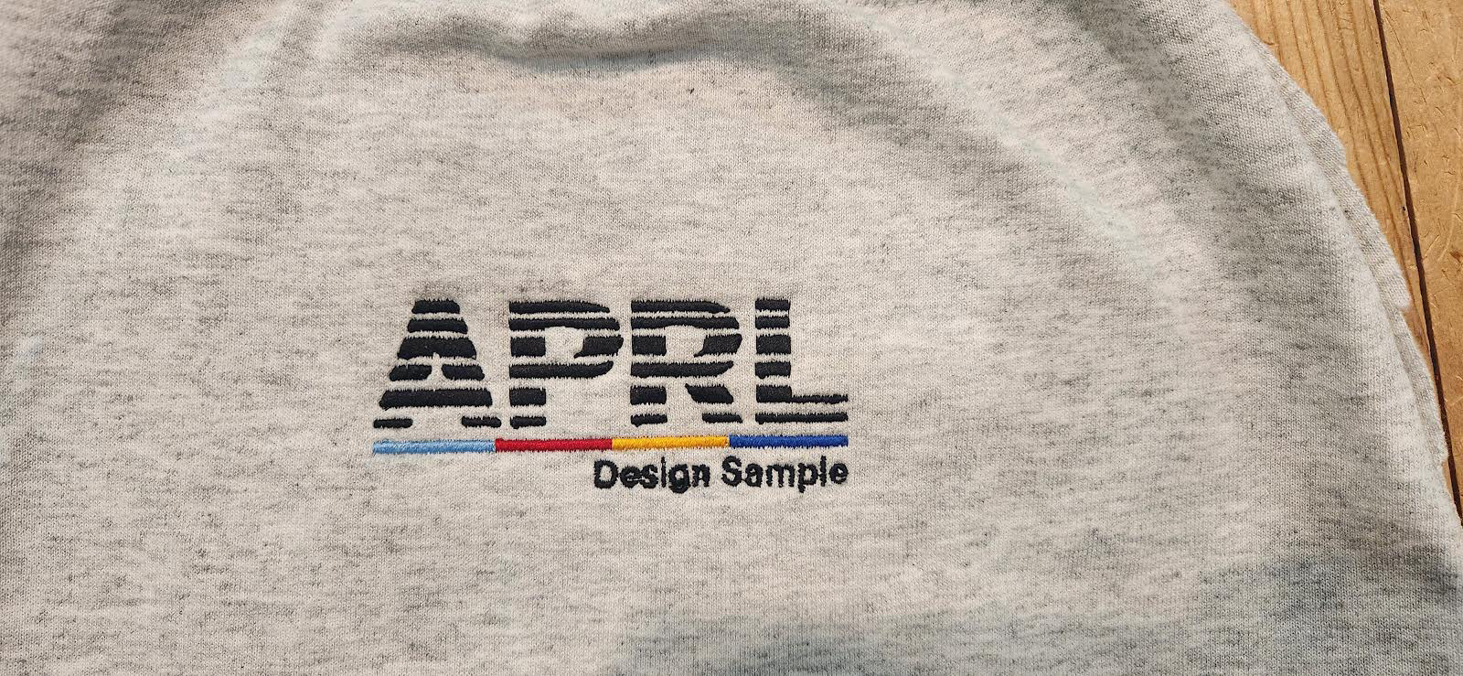
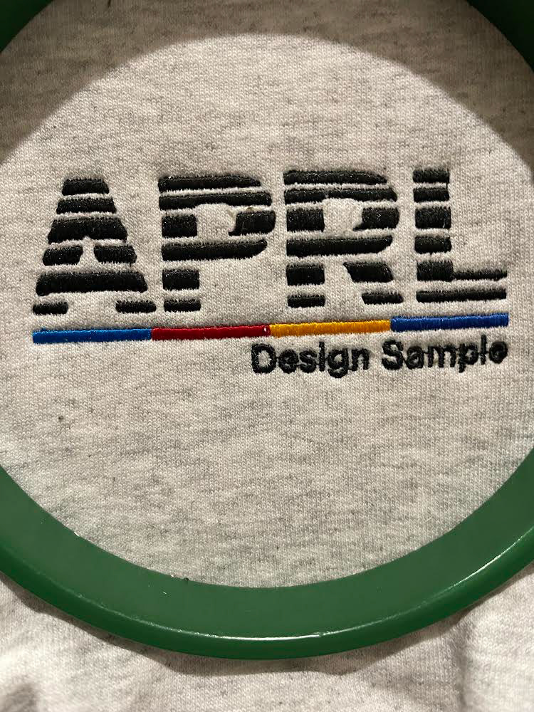
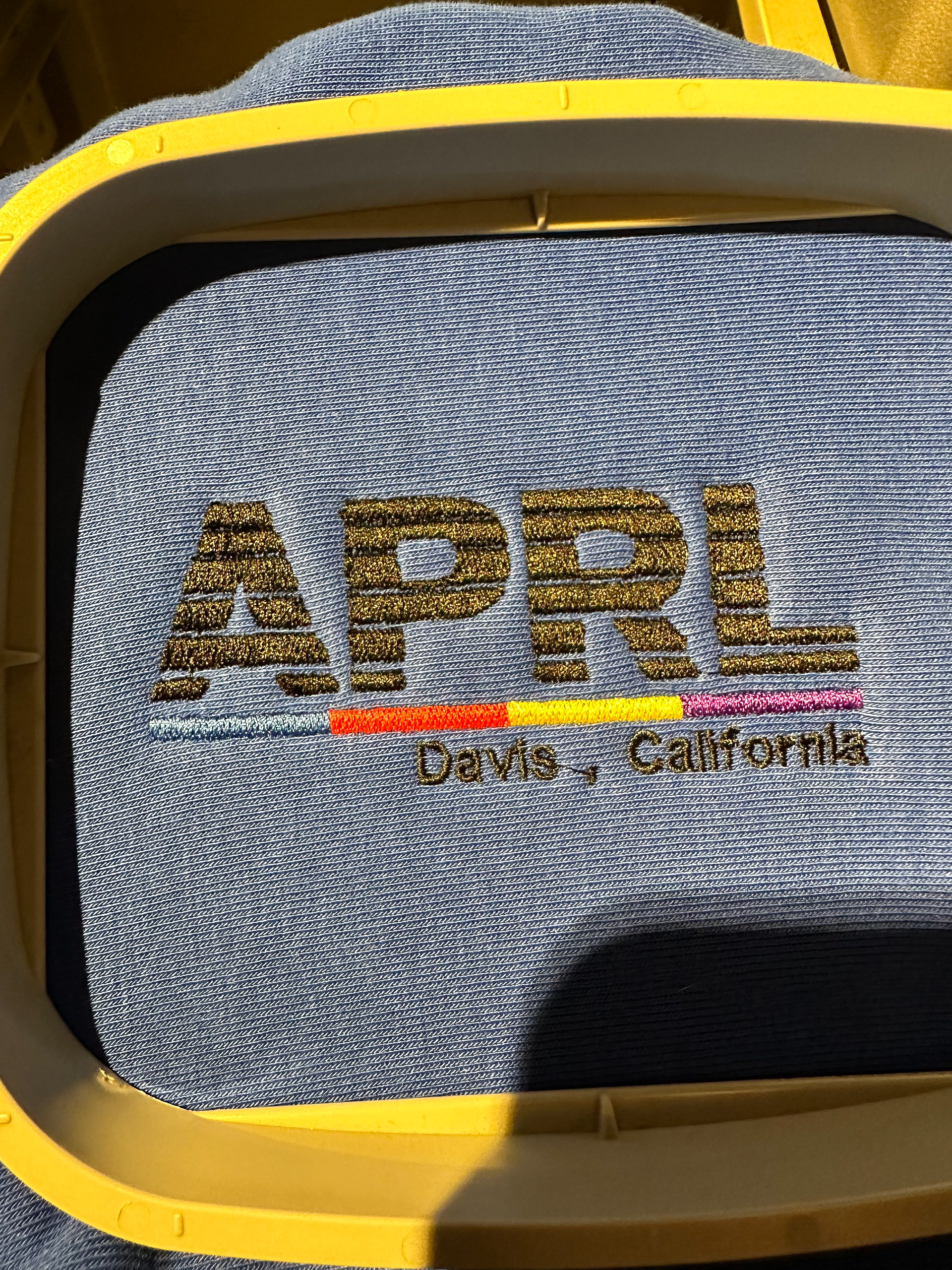
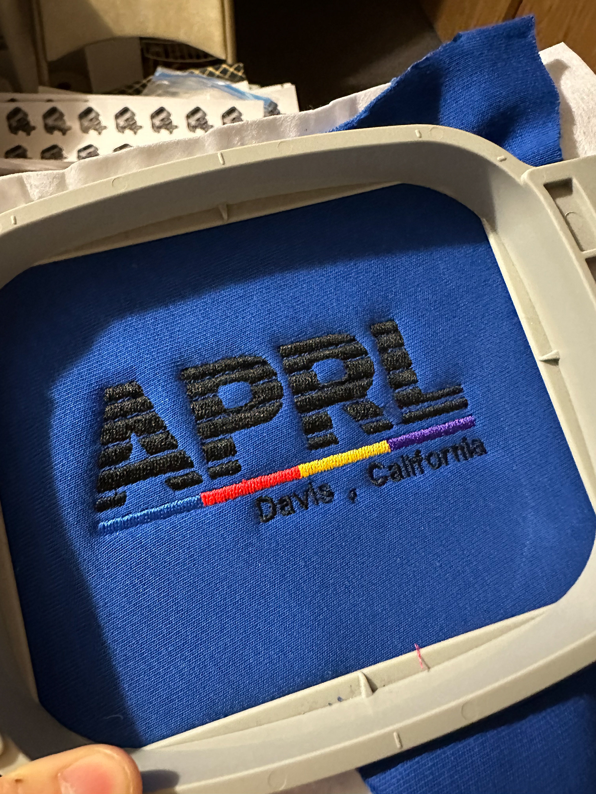
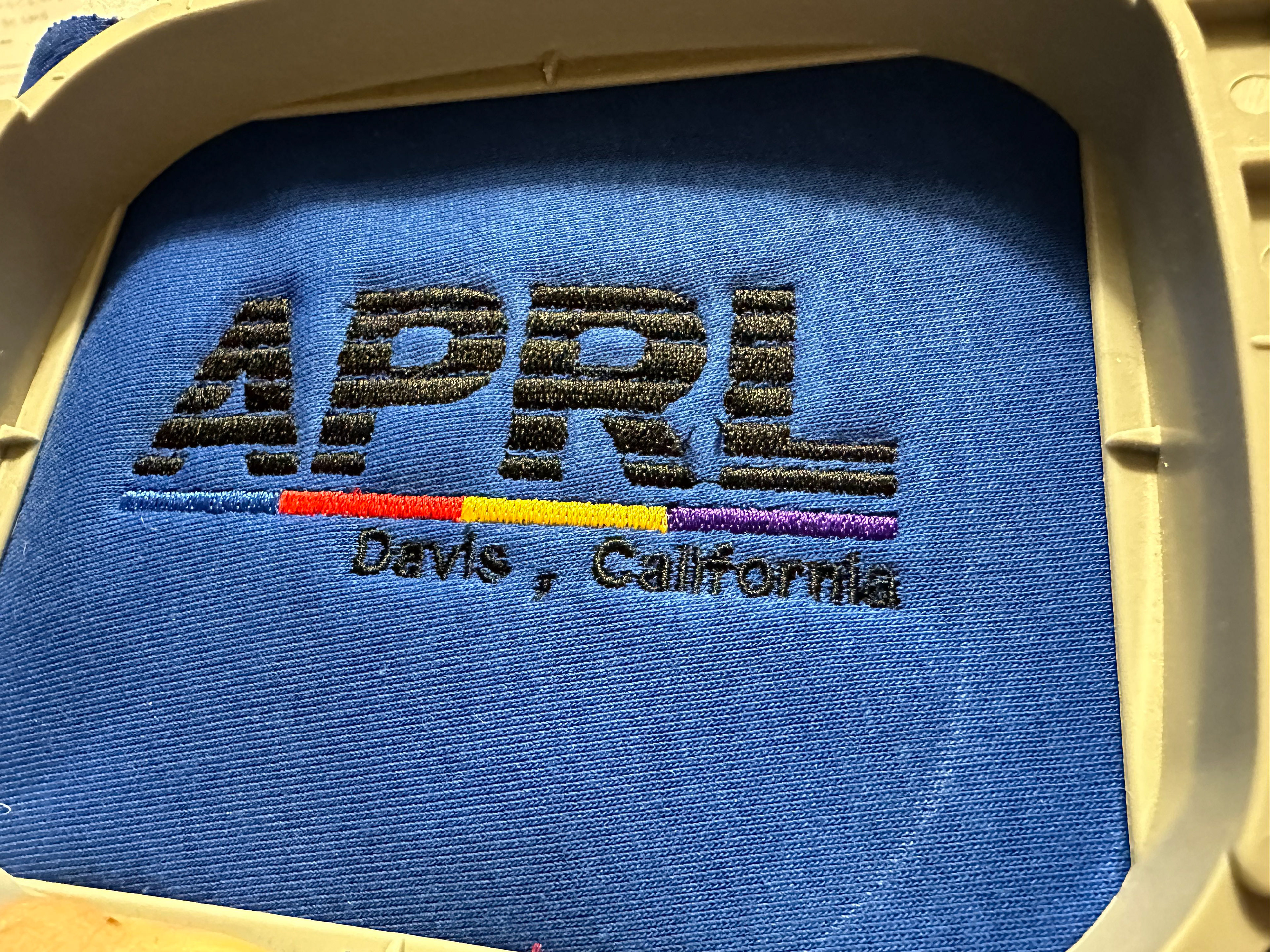
Embroidery test process
A large number of small tweaks were made to the design paths, embroidery process, and backing fabric to eventually arrive at a final process that we were happy with. This is the point where we finally got the first design samples to plan our photo shoot.
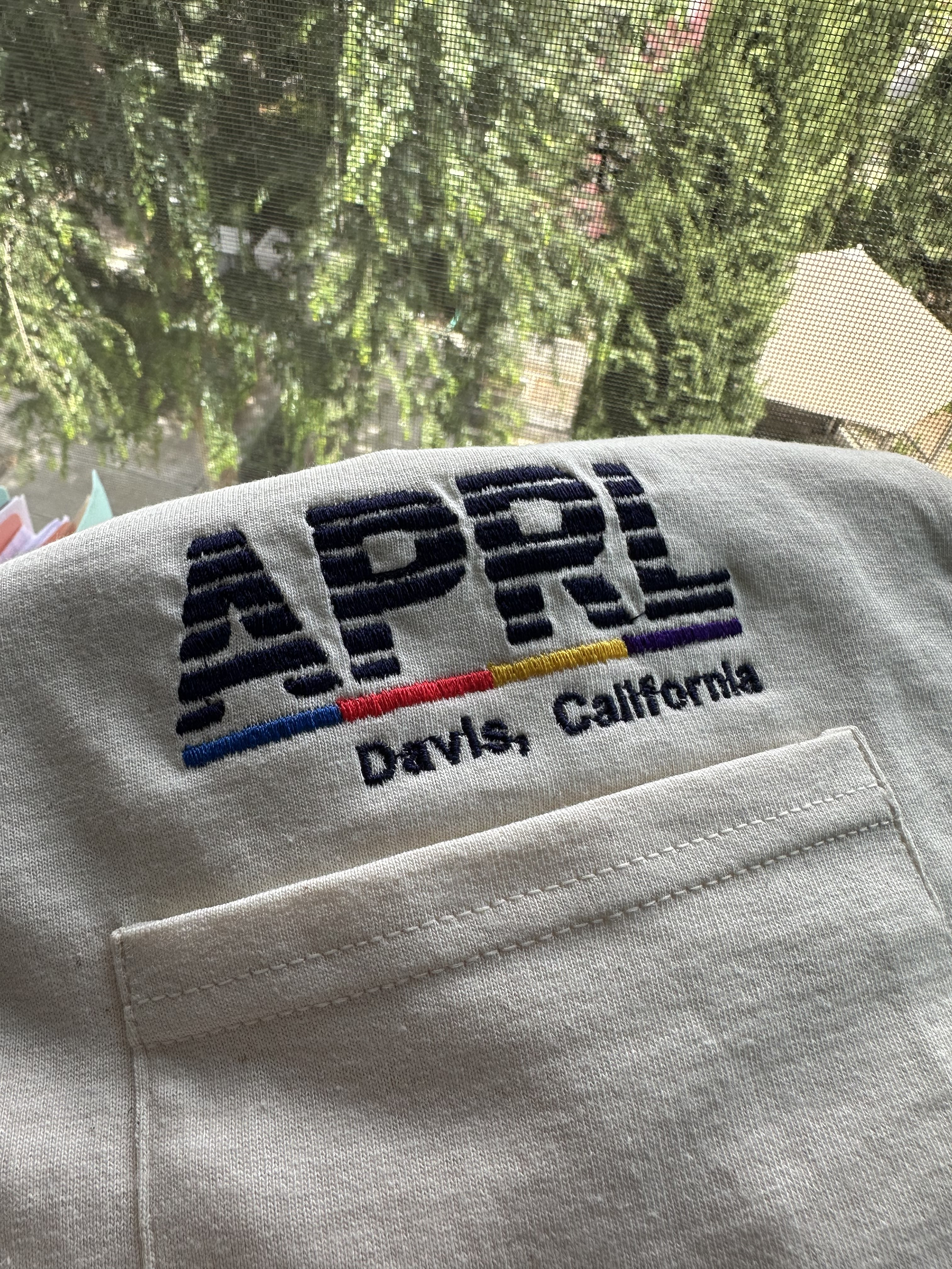
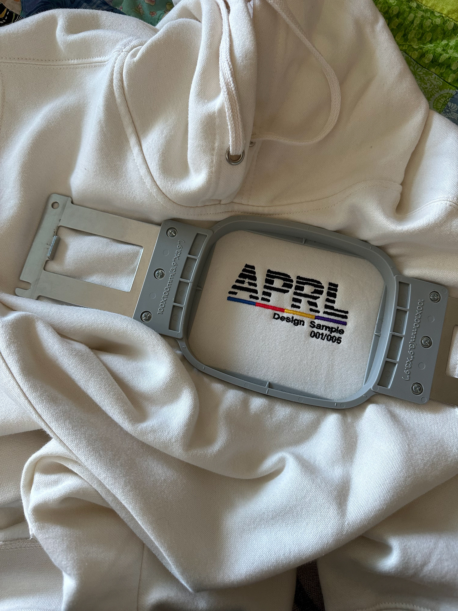
The shoot itself went smoothly - we went for an "old-school" style, with chalkboards and brutalist architecture. From there, all the photos were given a slight yellow tint so the cream color of the hoodies would be more prominent.
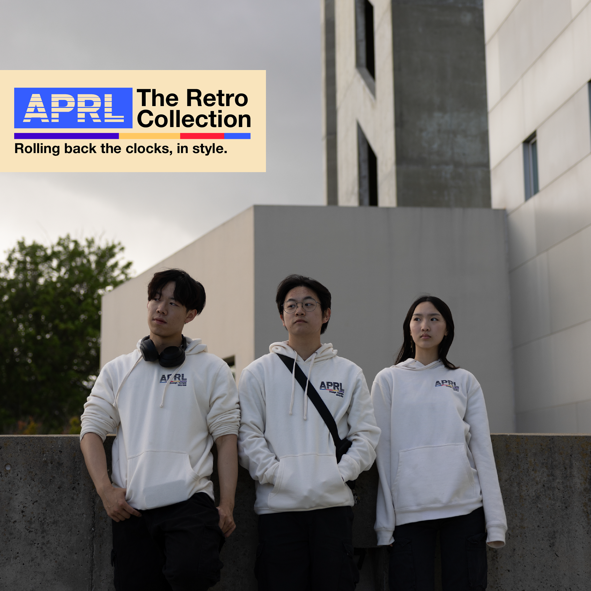
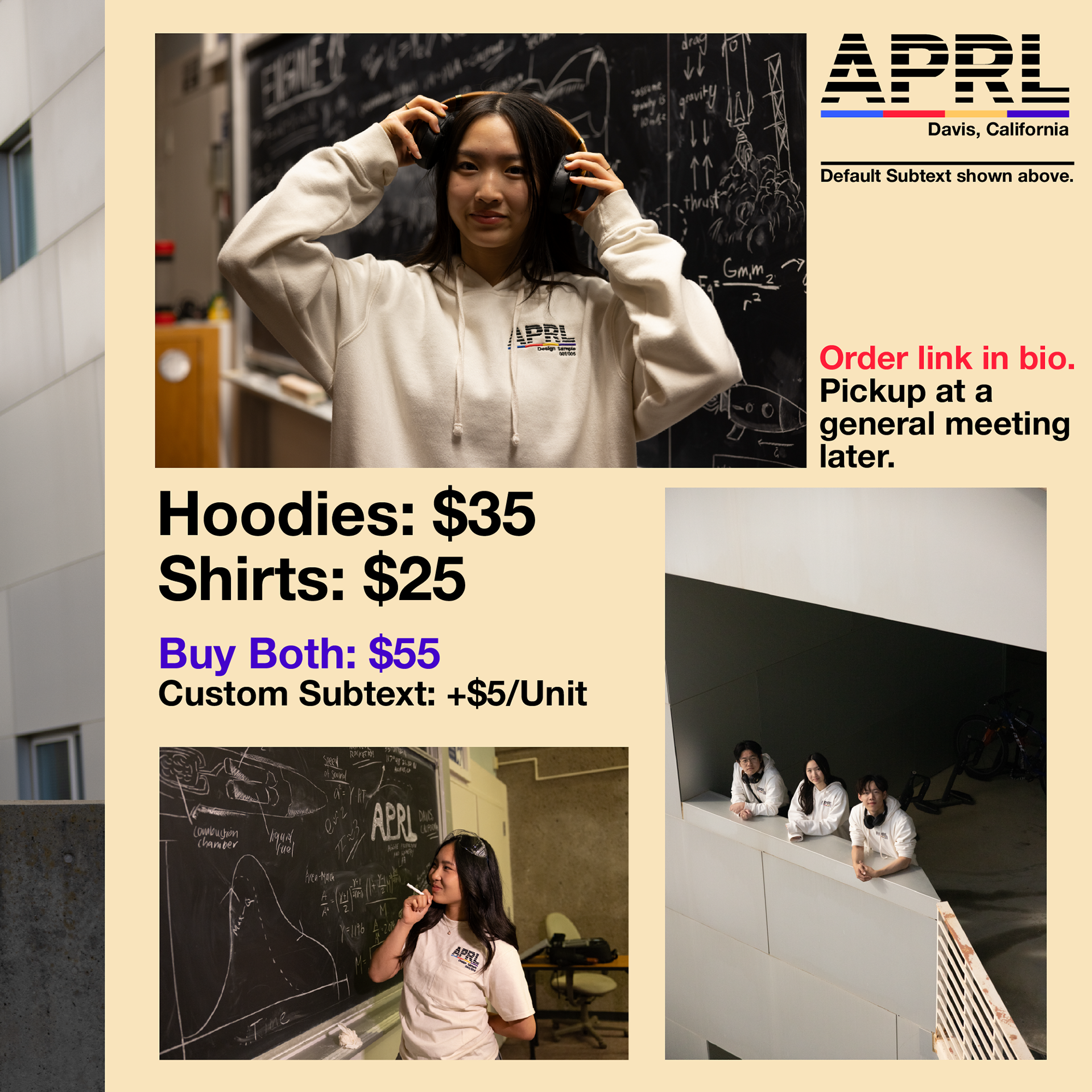
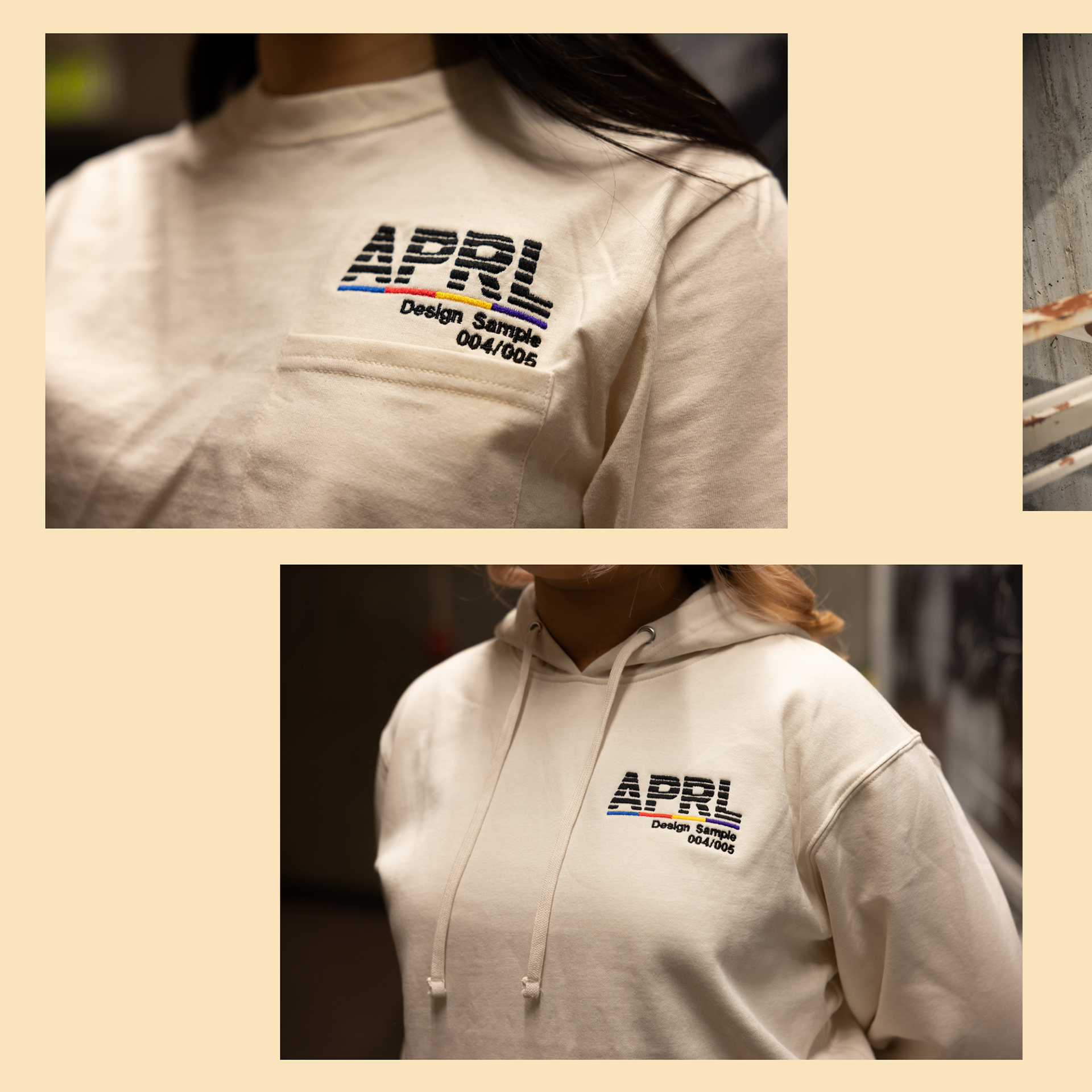
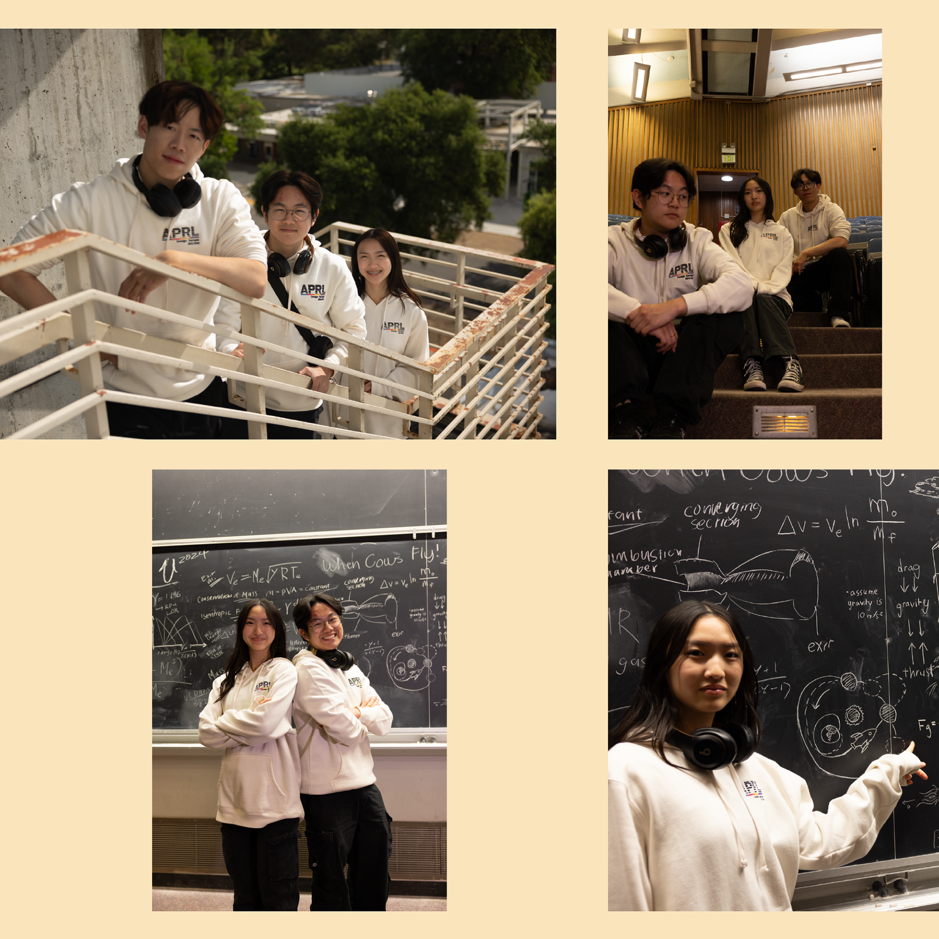
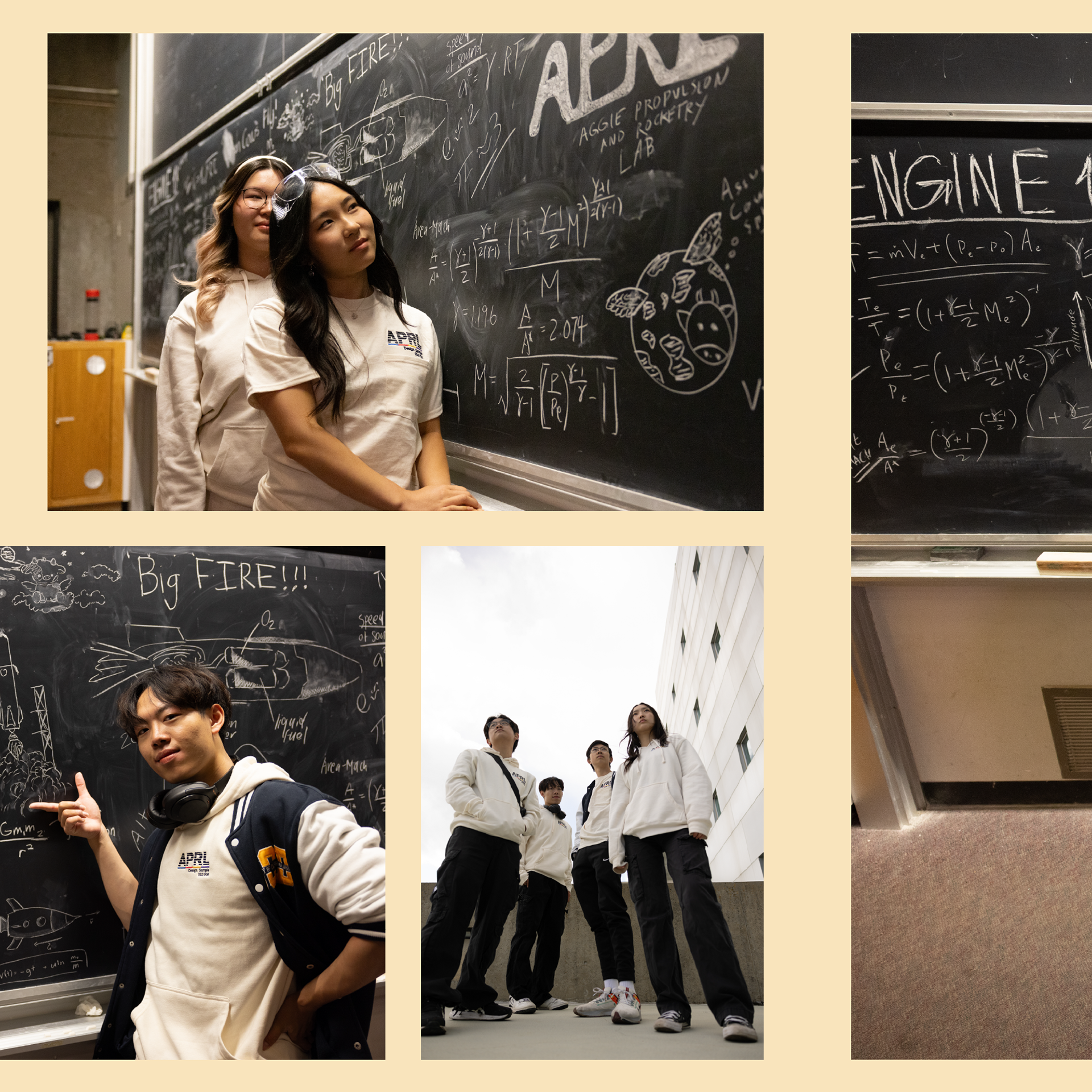
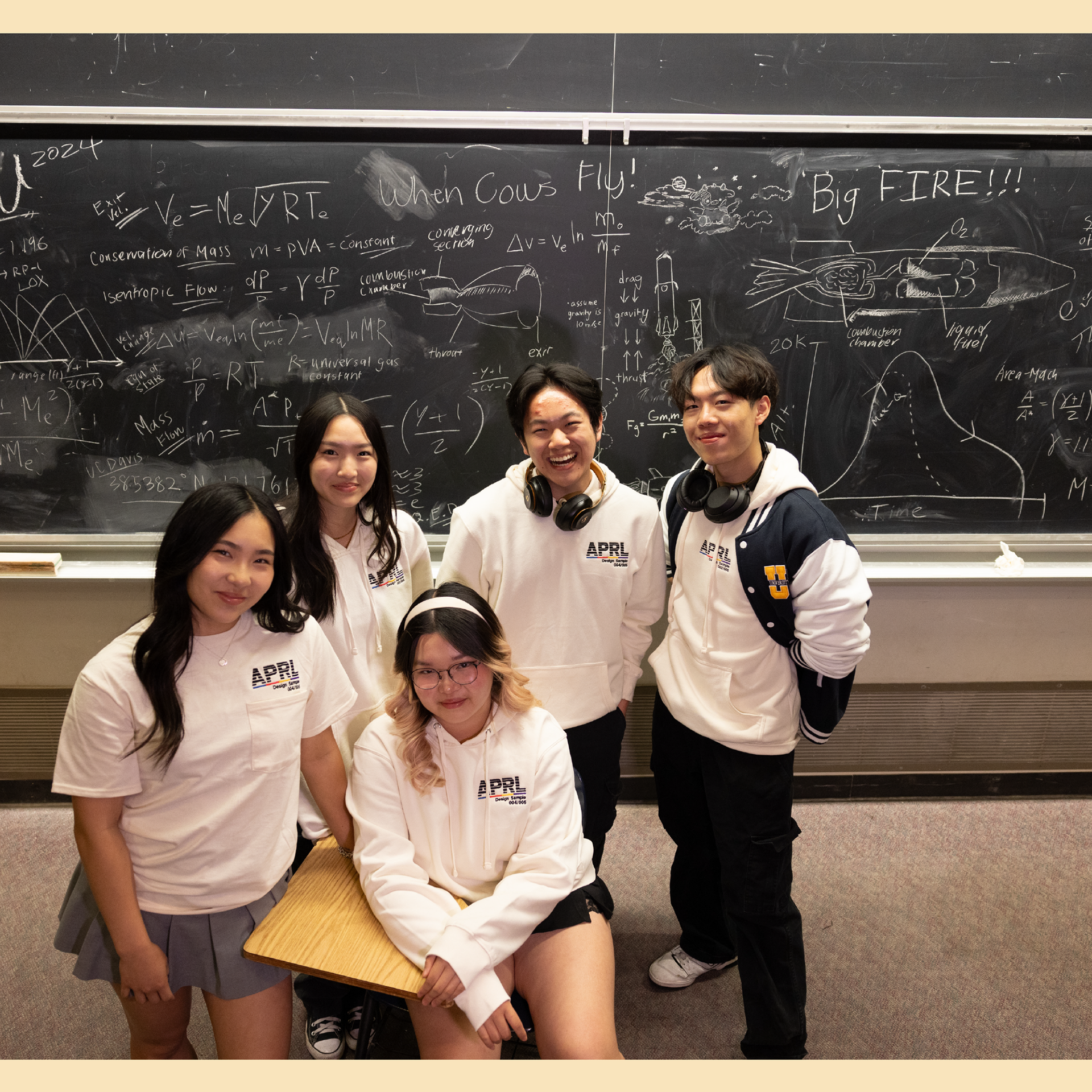
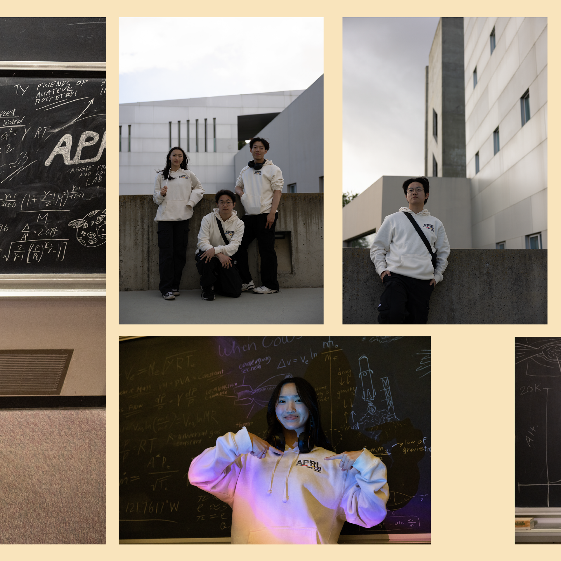
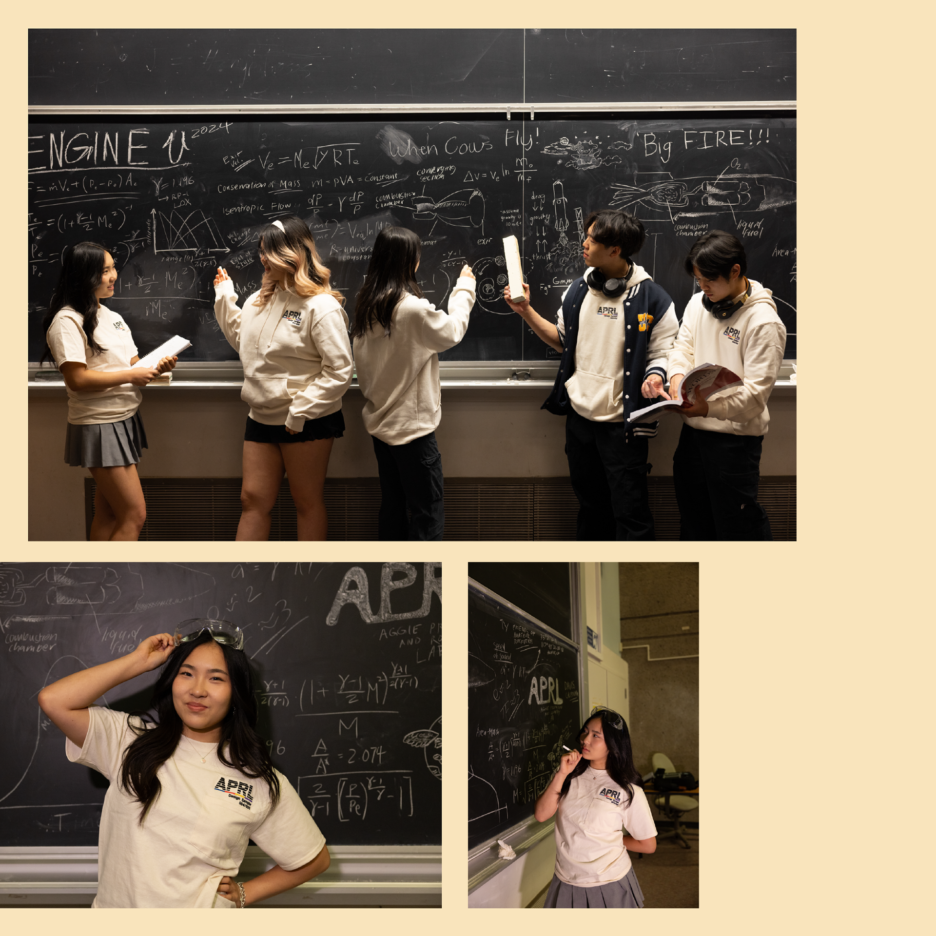

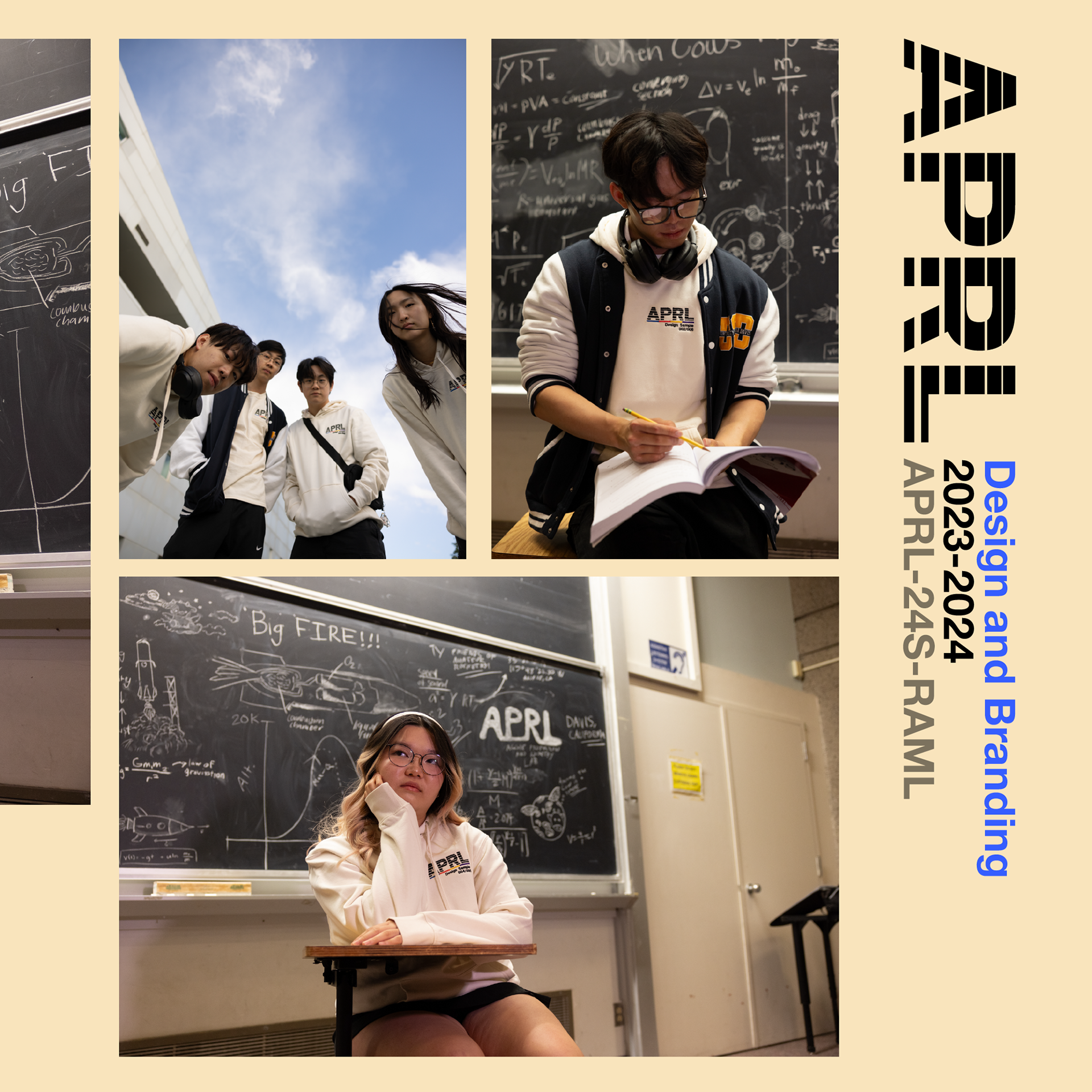
The Instagram announcement post was designed as a single, scrolling canvas, with overlap between the individual square slides to give a more seamless look. In the end, we accumulated nearly 80 orders, far more than any other merch run in club history. I'm excited to come back in the 2024-2025 school year to create a new, unique merchandising project.
